EAT IN ASIA / Lifestyle / Art & culture
Eco mat Bangkok Design Week
Tags: ART BANGKOK EXHIBITION THAILAND









Design Objective I
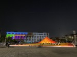
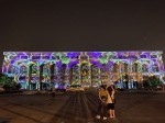
The objective is to bring people together at Bangkok Design Week. Creators pursued the concept based on a very basic notion of gathering: the act of sitting together. Artists looked at the everyday household item perfect for hosting such an activity - the Thai mat or “Sua”. It offers the simplicity of a surface where many can gather, and carries a symbolism of a communal activity.
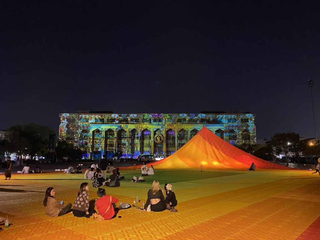
Creators invited all to sit together and enjoy each other’s company on the very large mat. They hoped that participants would discuss positive changes, and the role that the design could play in making Thai cities more sustainable places.
Design Objective II
Artists also promoted the use of recycled plastic and circular materials. The mats in this installation were made entirely of recycled plastic waste, and demonstrate the versatility and the fun of recycled materials.
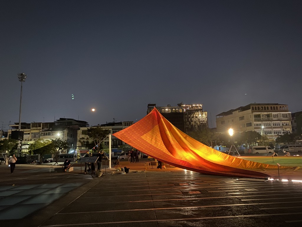
By displaying how recycled plastic can be used to fabricate an everyday object, artists hoped to inspire creativity in producing other useful commodities. In this way, they encourage everyone to consider what happens to the plastic after it has performed its function. Similar to the mats of the installation which will be upcycled or donated for further use after this event.
Design Concept
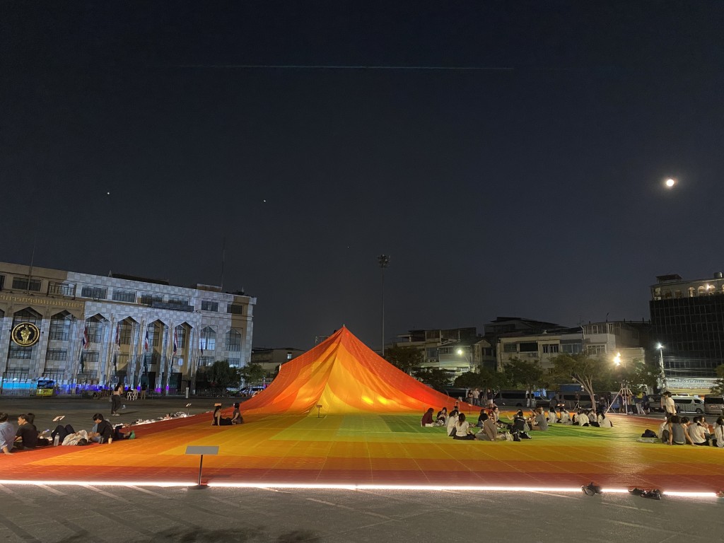
The inspiration of the mat design comes from the temple behind the plaza: Wat Suthat Thepwararam Ratchaworamahawihan. One corner of the mat is lifted to create a covered exhibition space, resulting in a tent-like shape that references the temple’s roof profile.

The pattern of the mat is also inspired by the temple roof where colours are offset from the perimeter towards the center. The layers of color serve as playful boundaries for activities curated for Bangkok Design week. Each mat is printed with a Thai textile pattern to reference the Thai art and culture industry.
Data Display
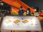
The proportion of colors is an infographic based on the statistical data of the plastic waste stream in Thailand. Each color represents a destination of plastic waste: red is waste that ends up in unsanitary landfills (15%), orange is waste sent to sanitary landfills (52,6%), and yellow is uncollected waste (11%).
Finally the green color at the center is the proportion of recycled plastic(21,4%) - a symbol of the Green Target towards sustainability. A gradient is applied as a representation of change. Creators hoped that this would happen in the near future, and this mat would become predominantly green.

Ideas for what the mat could be used
Music Events
Dancing Events
Outdoor Cinema
Yoga and Aerobics
Children’s events
Flea Market
Date: 2025-12-04
Author: Beti – A passionate traveler and lover of Asian cuisine, especially Thai and Japanese dishes, Bernadeta brings her culinary and cultural experiences to life in her writing. Beyond her travels, she’s an avid technology enthusiast with a deep interest in data processing, merging her love for exploration with analytical insights.
Photographer: Adalbert – An aficionado of computers and photography, Adalbert captures the essence of diverse cuisines with a discerning eye. A connoisseur of rich flavors and particularly fond of meat-based dishes, he combines his technical skills with his passion for the culinary arts in every shot.


